

CSS can be particularly frustrating, and many developers, including myself, have struggled with it. However, I recently discovered some amazing CSS features and techniques that have helped me overcome some of the biggest obstacles I used to face and that is why I'm thrilled to introduce this new series where I'll be sharing my knowledge and experience with these CSS features.
In each post, I'll explore a specific CSS feature, explain its purpose and capabilities, and provide examples and practical use cases. By the end of this series, my aim is for you to feel more confident and empowered in your CSS skills, and to be able to create fantastic designs and layouts with ease.
In this episode, we'll be focusing on creating fade-in and underline animation effects. So, let's dive in!
What are CSS Animation Effects?
CSS animation is a method used to add motion and interactivity to web pages without requiring external plugins or scripting languages.
CSS animation effects allow for the smooth transition of visual elements such as text, images, and shapes, making web pages more interactive and engaging.
In my experience, CSS animation effects are like the "sauce" that adds a special touch to web pages, making them more interactive and engaging. As a starting point, it's helpful to have some prior knowledge of CSS animations. With this foundation, we can dive right into exploring some amazing effects that can add interactivity and engagement to your web pages. If you need more information, websites like W3schools provide useful resources for grounding details on CSS animations.
I recently built a Space-X website clone following Traversymedia 's well-grounded tutorial and I had to apply CSS animation effects, which I hadn't used very often before. These effects included Underline animation, Fade-in, Fade-in-up, and Fade-bounce. In this episode, I'll be focusing on the Underline and Fade-in animation effects specifically and providing more details on how to use them.
Creating the Fadeinup Animation Effect

I started this by creating basic HTML and CSS documents. I also created and styled the section A part that we will be needing for the fade-in tutorial. Below are code snippets of what I already have:
<!--Section A-->
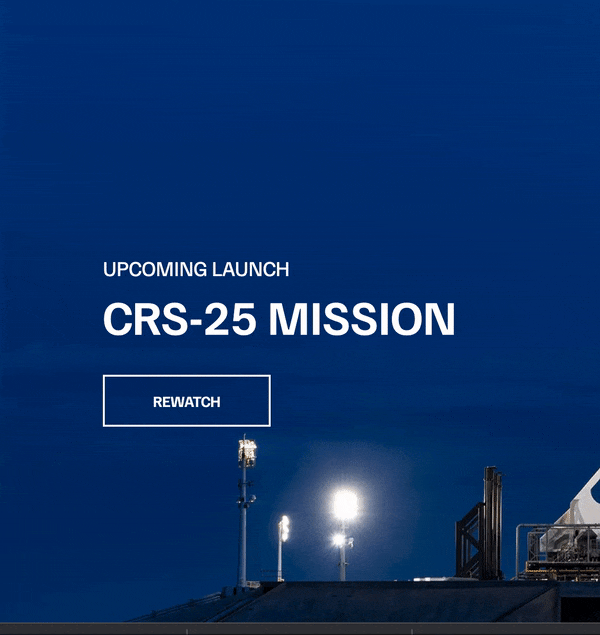
<section class="section-a">
<div class="section-inner">
<h4>upcoming launch</h4>
<h2>crs-25 mission</h2>
<a href="#" class="btn">
<div class="hover"></div>
<span>Rewatch</span>
</a>
</div>
</section>
body {
  font-family: "Familjen Grotesk", sans-serif;
  background: #000;
  color: #fff;
}
a {
  text-decoration: none;
  color: #fff;
}

section {
  position: relative;
  height: 100vh;
  background-position: center center;
  background-repeat: no-repeat;
  background-size: cover;
  text-transform: uppercase;
}
.section-inner {
  position: absolute;
  bottom: 200px;
  left: 150px;
  max-width: 560px;
}
.section h4 {
  font-size: 22px;
  margin-bottom: 5px;
  font-weight: 300;
}
.section h2 {
  font-size: 50px;
  font-weight: 700;
  margin-bottom: 20px;
}

.section-a {
  background-image: url("https://spacex-thegirlcoder.netlify.app/img/section-a.webp");
}

.btn {
  position: relative;
  display: inline-block;
  cursor: pointer;
  text-align: center;
  min-width: 30px;
  padding: 15px 50px;
  margin-top: 10px;
  border: 2px solid #fff;
  text-transform: uppercase;
  font-weight: bold;
  overflow: hidden;
  z-index: 2;
}

.btn:hover span {
  color: #000;
}
.btn .hover {
  position: absolute;
  top: 0;
  left: 0;
  width: 100%;
  height: 100%;
  background-color: #fff;
  color: #000;
  z-index: -1;
  transform: translateY(100%);
  transition: transform 0.6s cubic-bezier(0.19, 1, 0.22, 1);
}

.btn:hover .hover {
  transform: translateY(0);
}
The above code snippet should show you the following demo:

Creating the Fade-in Effect
To accomplish the fade-in effect, you can take the following steps:
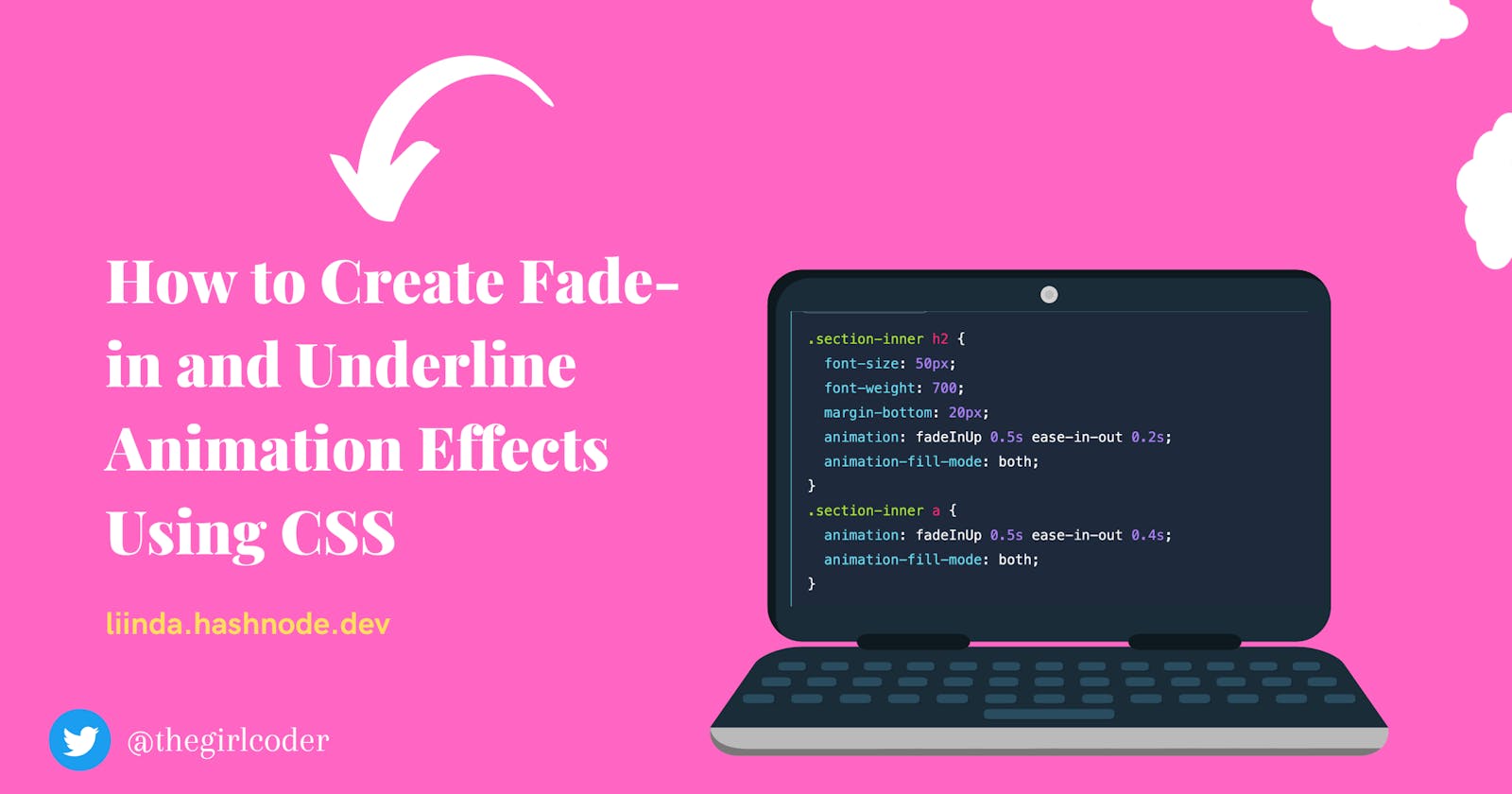
Create keyframe and set opacity values at 0% and 100%: This is the first step towards creating the fadeinUp effect. When the opacity is set to 0, the element becomes hidden at 0%, and when it is set to 1, the element becomes visible at 100%. A combination of both will result in a gradual fade-in effect as the opacity increases from 0% to 100%.
  @keyframes fadeInUp {
    0% {
      opacity: 0;
    }
    100% {
      opacity: 1;
    }
  }
Add animation to the styling of the
h4element of the section: Adding animation to the style of the above element helps configure properties like timing, duration, and other details of how the animation sequence should progress. The animation in this case will make theh4element fade in.section-inner h4 { font-size: 22px; margin-bottom: 5px; font-weight: 300; animation: fadeInUp 0.5s ease-in-out; }Add the animation and time delay to the
h2element: Adding animation will make the h2 element fade in. The additional time delay prevents it from fading at the same time as the h4 element..section-inner h2 { font-size: 50px; font-weight: 700; margin-bottom: 20px; animation: fadeInUp 0.5s ease-in-out 0.2s; }Add animation and time delay to the
aelement: Adding animation will make the element fade in. A time delay higher than the one on theh2element makes it fade later..section-inner a { animation: fadeInUp 0.5s ease-in-out 0.4s; }These above code snippets should make mentioned elements fade in as in the demo below:
Add transform property to the fadeinUp styling: This will make the elements fade in up on the Y axis.
@keyframes fadeInUp {
  0% {
    opacity: 0;
    transform: translateY(140px);
  }
  100% {
    opacity: 1;
    transform: translateY(0);
  }
}
- Add animation-fill mode property to the
h2andaelements: Notice that theh2andaelements show at the start of the animation, unlike the demo we are trying to recreate. The animation- fill in the property will help stop the elements from showing at the start of the animation.
.section-inner h2 {
  font-size: 50px;
  font-weight: 700;
  margin-bottom: 20px;
  animation: fadeInUp 0.5s ease-in-out 0.2s;
  animation-fill-mode: both;
}
.section-inner a {
  animation: fadeInUp 0.5s ease-in-out 0.4s;
  animation-fill-mode: both;
}
After you have successfully applied the necessary changes, your element should be able to smoothly and gradually appear on the screen in an upward direction, as illustrated in the demonstration provided below:

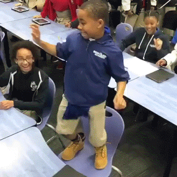
Congratulations! This is an amazing accomplishment and you should be bursting with pride. Let's do the happiest, most enthusiastic dance to celebrate your incredible win!
Now that we are done dancing, we will be creating the underline animation effect.
Creating the Underline Animation Effect
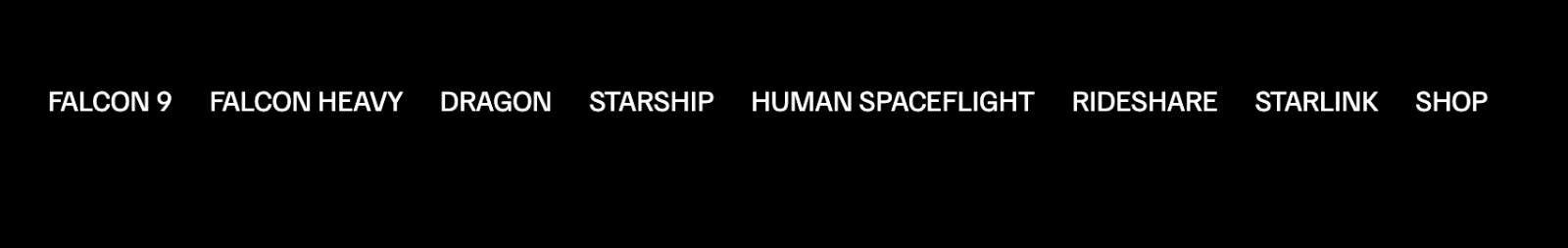
- I started by creating and styling the nav element.
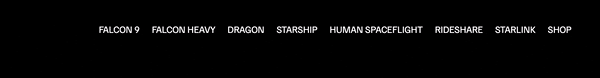
      <header>
      <nav class="desktop-main-menu">
        <ul>
          <li><a href="falcon9.html">falcon 9</a></li>
          <li><a href="falcon-heavy.html">falcon heavy</a></li>
          <li><a href="dragon.html">Dragon</a></li>
          <li><a href="#">Starship</a></li>
          <li><a href="#">human spaceflight</a></li>
          <li><a href="#">Rideshare</a></li>
          <li><a href="#">Starlink</a></li>
          <li><a href="#">shop</a></li>
        </ul>
      </nav>
    </header>

@import url("https://fonts.googleapis.com/css2?family=Familjen+Grotesk:ital,wght@0,400;0,600;1,700&family=Roboto:wght@400;900&display=swap");

*::before,
*::after {
  margin: 0;
  padding: 0;
  box-sizing: border-box;
}
body {
  font-family: "Familjen Grotesk", sans-serif;
  background: #000;
}
.desktop-main-menu {
  margin-right: 50px;
}
.desktop-main-menu ul {
  display: flex;
}
.desktop-main-menu li {
  position: relative;
  margin-right: 20px;
  padding-bottom: 2px;
}
ul {
  list-style: none;
}
a {
  color: #fff;
  text-transform: uppercase;
  text-decoration: none;
}
After inputting the above snippet, your Navbar should look like the one below:
That done, we will now create the underline animation effect by doing the following:
Create a pseudo-class for the pseudo-element ::after using the :hover selector
Add the Transform property: The transform property should be added to both elements.
Set the value of scale(X) at different points: Set the value to 0 at the after pseudo-element and to 1 at the pseudo-elements hover effect.
  .desktop-main-menu ul li a::after {
    content: " ";
    position: absolute;
    bottom: 0;
    left: 0;
    width: 100%;
    height: 1px;
    background: #fff;
    transform: scaleX(0);
  }
  .desktop-main-menu ul li a:hover::after {
    transform: scaleX(1);
  }
Your Nav bar should look like the demo below:

Add the Transition property: Set the transition to transform, add time, and add the cubic-bezier() function. This will create the transition.
Add the Transform-origin property: Add Transform-origin to the after element and hover.
Add transition duration: Add and set the duration for the animation effect to transition.
  .desktop-main-menu ul li a::after {
    content: " ";
    position: absolute;
    bottom: 0;
    left: 0;
    width: 100%;
    height: 1px;
    background: #fff;
    transform: scaleX(0);
    transition: transform 0.6s cubic-bezier(0.19, 1, 0.22, 1);
    transform-origin: right center;
  }
  .desktop-main-menu ul li a:hover::after {
    transform: scaleX(1);
    transform-origin: left center;
    transition-duration: 0.6s;
  }
Well done! Your Navbar ought to resemble the demon shown below.

Closing Thoughts
As we wrap up, let's take a moment to appreciate how animation effects have breathed new life into the world of web development.
Now, go ahead and let your creativity run wild! Experiment with the effects in different projects, mix and match styles, and have fun with them. After all, what's the point of web development if it isn't fun?
If you liked reading this article, please tweet about it and give me some reactions as I work on the next one! Also, If you would like to work with me please reach out to me on Twitter and I’d be happy to work with you!